
How many times have you tried filling out a form and groaned in frustration? Probably one time too many. Online forms are a necessity at times, but can also cause frustration. Sometimes a short sign up form can cause many problems if not done properly. Whereas a long registration form can be frustrating when everything you’ve filled in just disappears once the browser is closed. These things add up to a negative user experience – and you cannot have your users feel angry at the very beginning of your journey.
read more
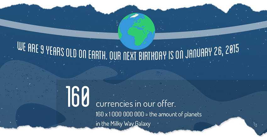
January 26th was our 9th birthday! To celebrate this day we’ve created an infographic full of facts from 2013. From the funny and quirky office things to the great new business heights that we’ve reached, this past year was truly a great one.
But our celebration didn’t stop there! Why? Because to commemorate this great day we’ve also launched a brand new website!
This year we published a great book on e-commerce, we’ve become an official payment institution, added more banks to our offer, increased the amount of opened accounts by 784,3% percent since 2012 (that’s 2529 new accounts in 2013 alone!), and traveled more than 20,000 km this year. And those are just the highlights of our year!
Check out how great this years travel through the business universe was:
read more
 Shopping cart abandonment can be a plague. The web is filled with reports estimating the number of abandoned carts from 55% to 80.30% . Your website can be beautifully designed and embody the latest trends, yet statistically only about 40% of your customers will complete the shopping process. That’s a bit discouraging.
But worry not! Sometimes a small change in the shopping process can save your income. We have listed 5 good customs (connected mainly, but not limited to design…) that can help you enhance the checkout process and make your customers experience better
read more

Enjoying the Holiday season one online click at a time! Here is a short infographic that shows just how we shop online once the holidays are just around the corner.
read more
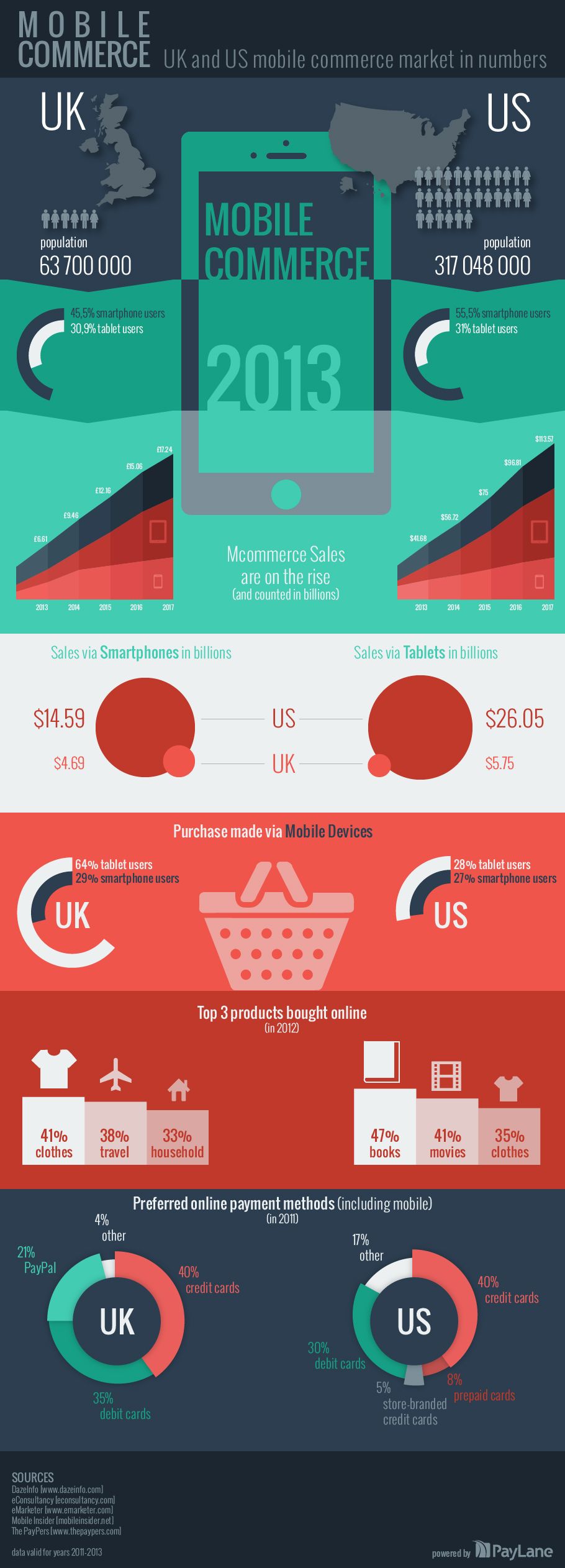
Considering focusing more on Mcommerce? Here’s a great infographic to see how the mobile commerce market is growing in the UK and US.
Embed this infographic on your website:
read more
 We are now well into 2013 and the “top 10” lists of design trends for this year stop being just wishful thinking. Imagine you want to re-design (or simply design for the first time) your web site. It’s good to check the current trends and stay up to date – at least with those hip elements you find applicable. The same goes for online shops. If you have one of those. You may find yourself browsing through the design trends and wondering: “do I REALLY need that?”
The question you should be asking yourself is: “does this really make my website / e-shop better?”
Let’s take a quick look at some of the most visible trends for today (we have April 2013) and see how they can be applied to an online shop. The opinions below are completely subjective.
read more
 Choosing specific payment methods is one thing that’s crucial when you implement payments on your website. You decide to include your customers’ favorites, naturally, and those you can afford. In the end the whole business has to be profitable. Still, entangled in all these musings, it is quite easy to forget about another factor: the currency.
If your main market is located only in the USA, or in Great Britain, or in western countries of European Union, you may not be aware that money comes in different currencies. You’ll be fine using just dollars, euros or pounds. Probably you won’t have to bother with anything else. But if you’d like to go absolutely global or aim for countries that have their specific currencies, some basic analysis is not only recommended, but will simply save you a lot of money.
read more
 Corporate brochures don’t have to be boring. There are instances when taking a different approach to design actually pays off. Sometimes it’s good to break the mould. Designing a corporate brochure is not an easy task. First, the brochure needs to convey the company’s spirit. It also needs to show the products, inform about company’s politics… Not to mention it needs to be visually attractive. Quite a lot for a bunch of printed sheets of paper stacked together. At the end of the day, the most difficult task proves to be making an unforgettable impression on the reader.
read more
 Take a retro rocket, spice it up with a flying superhero, add a pinch of subtle textures, mix together and leave to simmer. If only the process of creation was as simple as a cook-book recipe. In this case we could begin like this: take gallons of black coffee, hours of inspirational soundtrack and an occasional “eureka” moment… But, like with every project, this one begins with a concept.
read more
 First, a few words of explanation: when a client wants to purchase something from merchant’s website, he or she needs to fill in the special form, specify the payment method and validate the address. Some merchants had designed their own forms. For those who did not, PayLane has always had a form prepared. But recently, we have decided it’s time to have it refreshed.
The changes are visible at first glance: the design underwent a severe make-over, the green boxes are gone and everything fits a single form. Company details can be found in the top right-hand corner of the form: the merchant can customize this area with his or her logo and, naturally, company details.
read more


 Shopping cart abandonment can be a plague. The web is filled with reports estimating the number of

 We are now well into 2013 and the “top 10” lists of design trends for this year stop being just wishful thinking. Imagine you want to re-design (or simply design for the first time) your web site. It’s good to check the current trends and stay up to date – at least with those hip elements you find applicable. The same goes for online shops. If you have one of those. You may find yourself browsing through the design trends and wondering: “do I REALLY need that?”
 Choosing specific payment methods is one thing that’s crucial when you implement payments on your website. You decide to include your customers’ favorites, naturally, and those you can afford. In the end the whole business has to be profitable. Still, entangled in all these musings, it is quite easy to forget about another factor: the currency.
 Corporate brochures don’t have to be boring. There are instances when taking a different approach to design actually pays off. Sometimes it’s good to break the mould. Designing a
  Take a retro rocket, spice it up with a flying superhero, add a pinch of subtle textures, mix together and leave to simmer. If only the process of creation was as simple as a cook-book recipe. In this case we could begin like this: take gallons of black coffee, hours of inspirational soundtrack and an occasional “eureka” moment… But, like with every project, this one begins with a concept.
 First, a few words of explanation: when a client wants to purchase something from merchant’s website, he or she needs to fill in the special form, specify the payment method and validate the address. Some merchants had designed their own forms. For those who did not, PayLane has always had a form prepared. But recently, we have decided it’s time to have it refreshed.