10 SaaS Businesses That Know How to Take Your Money Online
“Better to be safe than sorry” – it’s a saying that contains a good piece of wisdom to follow.
When you are responsible for a growing SaaS business, it’s best not to get too much overboard with this whole trying-out-new-ideas thing. Sure. It’s exciting. But often heart-wrenching as well.
The easiest way to experiment with new business solutions, in a way that is safe and unthreatening to your pocket, is to learn from the best in your field. Everybody knows that, and thus – there are many reference materials for you to check out on the Internet. Our blog also contains various resources that are here to help you. Today we have prepared a list of good SaaS practices, along with exemplary pages that include them.
Have a look. These guys have it all sorted out!
SaaS Good Practices
1. Third party integration.
Using API became the daily bread.
Pages which you don’t have to leave even for a second while you make purchase look professional, and are easier to navigate than those that redirect you to the provider’s page to make payment. The checkout is faster and the client is less prone to feeling disoriented.
Simply speaking, API visibly improves customer experience.
You can implement API not only on your page, but also as an in-app payment solution.
There are many other possible integrations: you can use external accounting, various customer relationship management systems, plug in an e-mail marketing tool, and so on.
Example: Mention
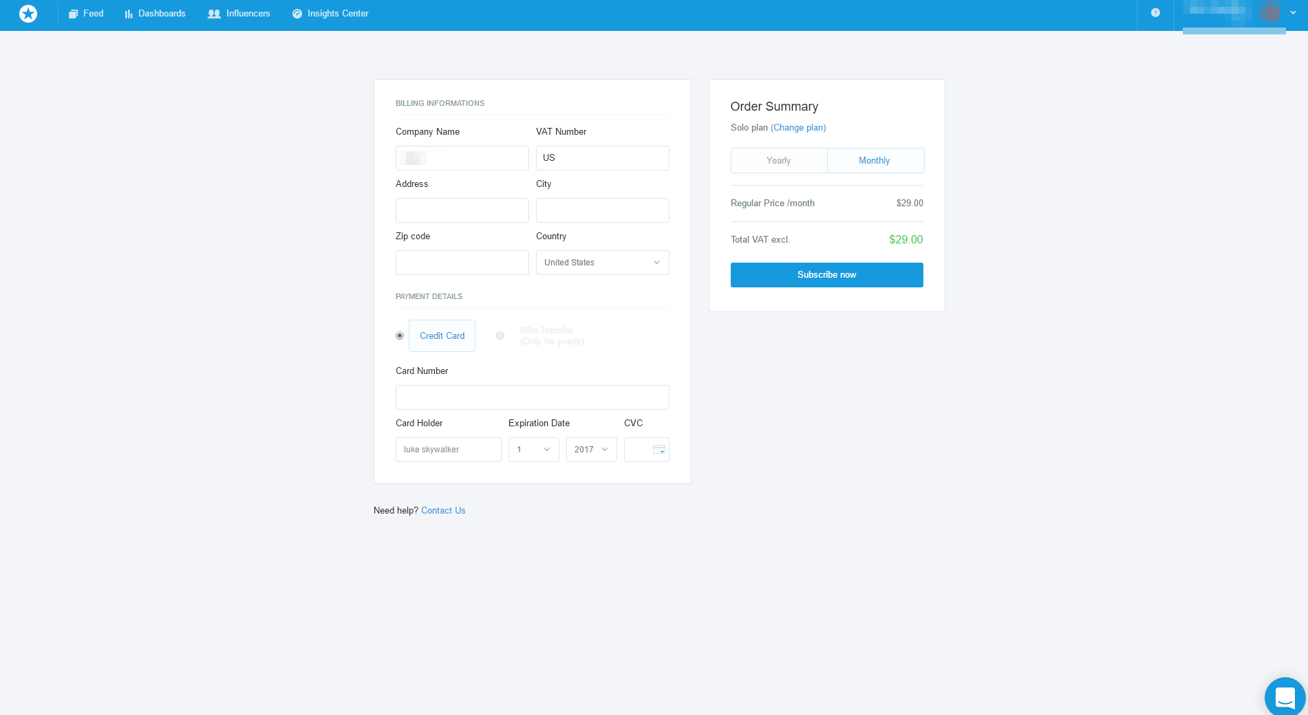
Mention allows you to monitor social media real-time and to track data in regards to your brand, product, competition and client base. And wow! What a good-looking form we have here! Mind you, the design looks just as good as the rest of the page. It’s, in fact, identical. And there is no redirect. All thanks to API.
2. Choosing currencies.
There are many ways to determine what your client’s preferred currency is. Depending on the webpage’s language settings, browser’s language (based on IP), domain used (.eu, .ru etc.) you can predict how the customer will want to pay you. You can make great use of that knowledge and meet unspoken expectations this way. And the easier it is to pay, the more likely it is that the customer will choose you over other competitors.
Example: Nozbe
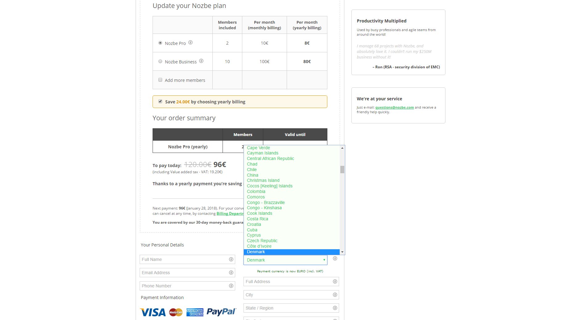
Nozbe is a popular project management tool, used both for boosting personal productivity and for more effective teamwork. The payment form on the page lets you choose the country you are in, and after you make a change – the currency in the form changes accordingly.
3. Payment options tailored to client base.
If your customers are located in Japan, they might want to use JCB. If they are from Poland, they’ll surely appreciate pay-by-link money transfer. Dutch clients may want to choose iDEAL. And so on, the list continues.
The main point here is: people purchasing your product will give a warm welcome to the local payment methods. Not only that. If you gather enough information about their other preferences, you can further adjust your processes to pinpoint the best method.
It would be also perfect if you implemented the possibility of using, for instance, various credit cards on one client account. If somehow the payment for one card can’t get processed – there’s always a possibility of collecting money from another one.
Just like with the choice of currency: the client always goes for the payment option that is most convenient. Whoever offers the preferred option – has a big advantage right from the start.
Example: Slack
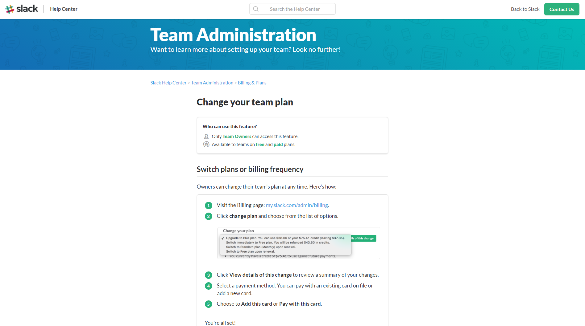
Slack is a widely used tool for team communication and project management. The software allows its users to add more than one payment card to their panel, which makes the payment process more convenient.
4. Recurring billings.
We all get easily distracted by lots of pressing matters in our everyday lives. Automating the future payment process is, very often, a true lifesaver for many of your clients. If you ensure that they only have to fill out the payment data form once, and then can stop caring and remembering about paying you on time, you take away a great burden from their shoulders. Every month SaaS initiates the recurring payment and collects the money from card by itself.
Example: Squarespace

Squarespace lets you create a webpage or an online shop in a few minutes, without the necessity of doing any coding. It was launched in 2004 and quickly gained a lot of popularity.
The service is SaaS-based and operates on the auto-renewal billing system with annual and monthly payment options.
5. Easy to find information about services.
Aren’t we all visuals? Our brains put a lot of significance to things we see and easily get overloaded by watching too much of clutter. This is precisely why UI and UX design favors light, minimalistic designs. Ones where the negative space leads the eye to the most important pieces of information. Information such as, e.g., available payment methods. The logos of banks and card institutions catch the buyer’s eye instantly, so they’re usually displayed in a well visible place. This way the client knows the options in half a second.
Example: Unamo (previous name – Positionly)

Unamo offers powerful SEO tools and competitor analysis. Their pricing page is a great example of well-thought minimalism applied in design. No clutter detected. All information is served succinctly, every option is easily understandable.
6. A clear return policy.
Also: The ultimate list of 8 Must-Haves for Terms of Service in your SaaS business
When you are about to buy something, you probably want to know what you can expect if things somehow go wrong. Or if you want to resign from the service and get a refund. On your selling page there should be a section that explains these matters clearly. Make this section as easy to find as possible.
Example: Pipedrive
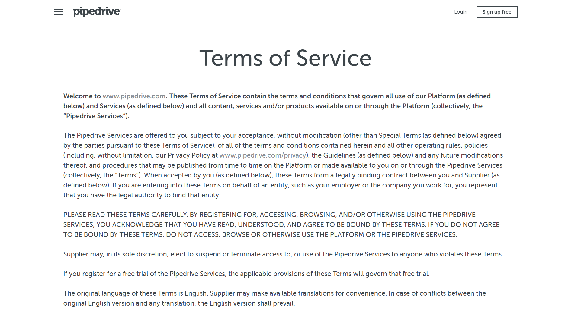
Pipedrive has built a great small business CRM. On the presented screenshot of their ToS page there are no distractions, and the sans serif font contrasts with white background, ensuring high readability. No treacherous small print in sight. Good job, Pipedrive team!
7. Transparency from the start.
If you offer a trial, do it along with disclosing clear information about online payment required after the demonstration version of the service concludes (or during it, if the service is based on a freemium model).
The clients should know if they have to give all the information during the registration for the trial period, including credit card data, or if they are allowed to fill out that data after the demo version ends or they want to upgrade the account.
If the client has to hand the card information straight away, and the service is set to collect payment or lock a certain quote for a certain period of time – you need to let the client know what sum of money it will be, for how long it will be blocked etc.
Example: Unbounce

Unbounce lets you easily build landing pages and overlays via its drag and drop builder. The page offers a free trial. Looking at the form – you know straight away what awaits you. There are credit card data to fill out, but there’s also the information about billing and the possibility of cancelling before the first payment is collected.
8. E-mail notifications and invoices.
Although it’s easy to lose a message in a heap of spam almost every inbox receives every day, the clients expect to get an e-mail after they make purchase. Usually, it’s a notification about the payment with all of the transaction details. Oftentimes, it’s also an invoice (ready to forward to the accounting department) and/or a link to the panel in which you can download the invoice whenever you need it.
Example: Basecamp
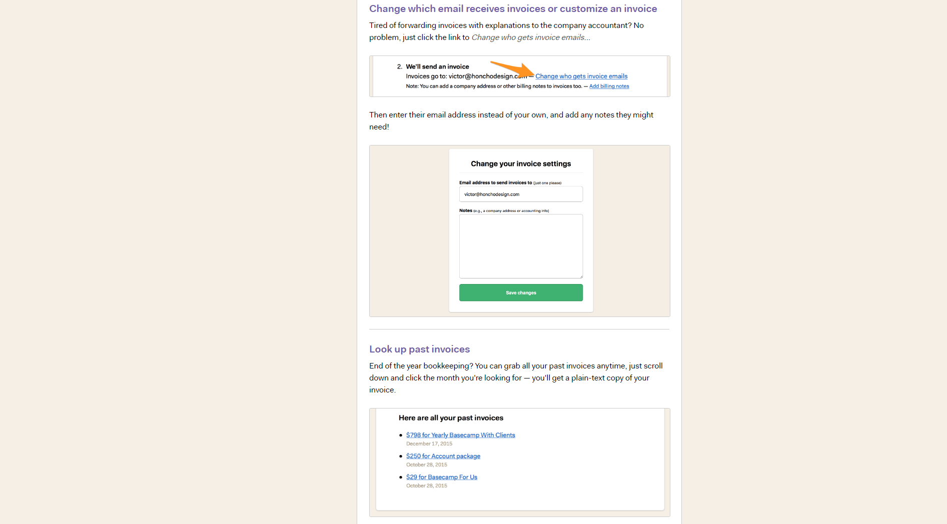
Basecamp is a project-management SaaS. It has various communication tools: message boards, to-do lists, real-time chat. You are also able to store documents and files. It gives you the option to customize the invoice sending, and stores the past invoices.
9. Easily understandable rate sheets.
When your clients look at the rate sheet, they must be able to tell the final price, or at least to know the reasons why they can’t know it precisely yet.
If there’s a sum to pay upfront and later the money is collected automatically, let it be known to everyone who sees your pricing section.
Demonstrate the particular components of the final price. Mention it, if final price is determined by the number of active users, number of operations, the size of available space etc.
Example: Chartmogul
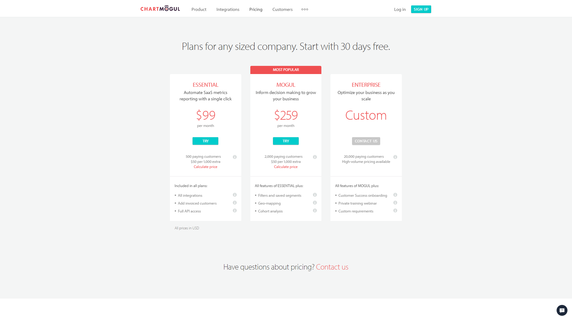
Chartmogul helps you understand your customers by automatically calculating metrics in real time. Although the service itself may be a little tricky when it comes to pricing, there is a clear information about the factors that are considered during determining how much you will pay. There’s also a price calculator, which certainly comes in handy.
10. If someone wants to go – let them!
Sometimes a customer leaves. Whether you make it easy to resign or decide to create obstacles is all up to you, but to leave a lasting positive impression it’s wisest to ensure that the resignation process is easy. Manageable from the client’s panel. It makes no sense to try to lure people back in by requiring personal contact. We are past that point already. Let your customers go and, who knows? If they effortlessly downgrade their account and go away for some time, maybe one day they’ll be back! Fingers crossed.
Example: Survey Monkey

Survey Monkey helps you create many types of surveys: from a simple poll to an in-depth marketing research. The clients can use the Help Center and easily access the information about required actions if they want to stop paying for using the service and downgrade the account.
Reinventing the Wheel Is Tiresome
Well-designed tools make their users enthusiastic about them.
If you want to be sure that your page meets the expectations, try to stick to tested methods, at least for starters. The “everyone has done that before” in this particular case is a good thing. It is so because, while slowly creating the model that prevails today, the best of the best had the time (and resources) to tweak the usability to the highest level possible. And you can own their successes!
It would be a truly difficult task to succeed while not taking account of well-trodden tracks and going to a jungle alone, armed only with a machete!