Facebook covers – the making of

Everybody (and their uncle) knows about the Facebook Timeline. On March 30th the brand profiles changed their look. Some companies embraced the Timeline earlier, which made the design job a real challenge: how to do something quite original and stay within the borders of company’s policy?
PayLane’s TimeLine – time-consuming but rewarding
We wanted something special for the PayLane’s Facebook cover. Naturally, it had to be connected with our business: credit cards, online payments… But we wanted the cover to convey more than that. We wanted to show that we are a group of people with passion for payments.
We started with a regular credit card picture:
But it was not what we were looking for. The idea itself was great, but once we tried to put it on “paper”, we saw the shortcomings. We knew it was supposed to be a credit card and a chip, but everybody else did not see the shape. So, it was back to the drawing board.
We tried something different. Once, we had a poster with company values prepared. Using, or rather, re-using them was not such a bad idea…
But it had nothing to do with payments. Plus, it was a bit dark. Or darkish. It didn’t ring right.
At the end of the day we’ve decided to go against everything we saw on other brand’s profiles: the team photo.
The first draft used the photos from our first team photo session and we all knew this was not the final version, but it gave us the gist. From this point onwards, we could work with what we had. We took some new photos, we redesigned the background and repositioned the folks. We made our boss lean on the logo box! We came up with a slogan under the logo which conveyed the message behind this cover.
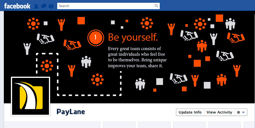
And that’s it! You can see the final design on Facebook:
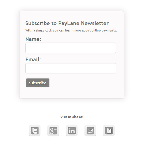
But the cover was not everything. Timeline sort of forced us to redesign other elements of our Facebook profile. The application buttons were one thing (you can see those on the screen above) but what was under those buttons were another thing. We’ve redesigned the newsletter form (simple and clean, just for Facebook!)
For our Affiliate Program we’ve designed a temporary information page:
That was not all! Facebook made it possible to put up a special photo for a special occasion: the birth of our company! We had a few concepts and most revolved around the idea of something made out of stone… Unfortunately, those were a bit too… serious.
Just take a look:
Just a day before the deadline, we came up with another idea: the birth certificate! And… there we have it!
Just what we were looking for!
Mr. Banks – the real virtual person
With Mr. Banks, the approach was different. We didn’t want him to be all corporate / brand-like. We’ve decided to treat Banks as a real person… And what does the Timeline of a real person look like? It has a cover with a personal photo.
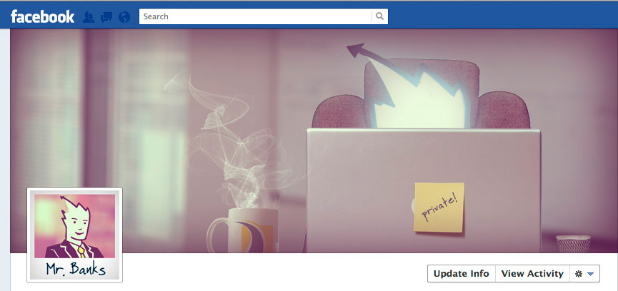
Truth be told, the first design of Banks’s cover was the final one. Well, almost. We wanted to show Banks in the office, probably working ;)
As you can see, it didn’t change much. We’ve lifted Banks’s head a bit and gave him a more comfortable chair plus some office utensils on the desk – but that was it.
Just out of spite, we’ve decided to change the perspective and have Banks turned a bit:
This didn’t ring true to us. The first view stayed and you can check it out at Banks’s Facebook profile.
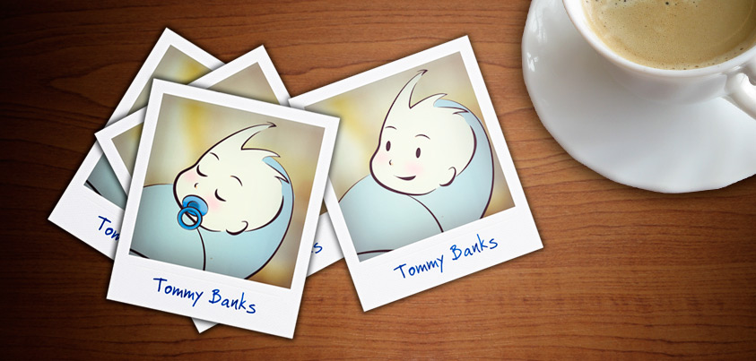
As with PayLane’s Timeline, we’ve decided to give Banks a true birthday milestone. After all, he is almost a real person.
So there it is: Little Tommy Banks, fresh from the nursery. The polaroids are scattered on the table, close to his favorite coffee. Naturally, he didn’t drink that coffee as an infant… It’s a contemporary picture, and Banks is showing us his early photos… (I swear, he did bring a bunch of them to the office on Monday!)
Platniczo.pl – the online newspaper
We know, we know. Platniczo.pl is not an online newspaper per se. But it does have this feel to it, which made us think of this picture:
We did use it, as one of the landings under application buttons. But the cover called for a different type of imagery. The first idea was to have something clean and connected with speed:
But we though it lacks the idea of words. From that moment, we’ve become inspired by weighted lists (or tag clouds, as you like it). After all, Platniczo.pl is a blog and words are its predominant force.
It was not difficult to compose the tag cloud: the blog does have its own tag list. It soon became evident that the word “płatności” (payments) was the most common word on the blog! Which is pretty important for a blog about payments…
Redesigning all these Timelines was a great challenge and the whole PayLane team got involved. We’re already looking forward to another obligatory changes and design challenges that come with them – bring it on, Facebook!

