5 tips to make your online form even better
How many times have you tried filling out a form and groaned in frustration? Probably one time too many. Online forms are a necessity at times, but can also cause frustration. Sometimes a short sign up form can cause many problems if not done properly. Whereas a long registration form can be frustrating when everything you’ve filled in just disappears once the browser is closed. These things add up to a negative user experience – and you cannot have your users feel angry at the very beginning of your journey.
Let’s identify some problematic areas and provide a few tips as to how improve the user’s positive experience:
1. Explain what should be filled in
Sometimes it is not obvious what should be put in the blank box and in which format. A user gets confused with laconic labels: if something is clear to us, it does not mean that it is for a first-time user. We breathe our business, however a potential customer does not have to possess the same level of knowledge. An explanation helps, but how can it be done?
- A placeholder in the blank box can explain the format of the data and suggest the answer
- An explanation/description corresponding to the blank box or hidden under an ‘info’ button
- An explanation/description triggered when the user clicks on the blank box
There are pros and cons to each of these methods. The placeholder should be short and concise. You cannot fit in a whole definition there, just examples – so when it comes to complex terms, you are still at a loss.
If you decide to put this complex explanation under an ‘info’ button, you can find your users may not click on it at all. On the other hand, cramping a lot of text close to the blank space might impair legibility.
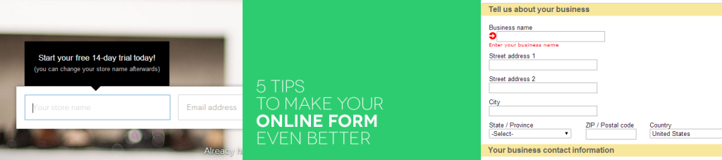
How about marrying the two? Keep the ‘info’ button close to the blank space, but make it pop up a text info whenever the user clicks on the field and starts filling it in. This way the screen is not cluttered, but the information appears when it is most needed. Plus, the very act of “popping up” brings user’s attention to the new element – and there is a chance he or she will read the instructions. Take a look at Shopify and how they made their blank boxes work:

2. Save data in long forms
Every once in a while, in comes a really long form to fill. And sometimes you don’t have all the data to fill the form at hand – then you wish you could just save what you did and come back to filling it in later… For long forms this option is truly a must!
Consider adding a button that will allow your users to save the data, or have it done automatically at a specified interval. In the latter case, inform your users that such an action is taking place.

3. Automatically fill in extra data
Help your users by automatically filling in some data they often forget about. A case in point for us at PayLane, appeared in our own application form. A Merchant that was applying was asked to enter an estimated monthly volume. The text in a field description asked for the currency – yet almost nobody actually wrote in what currency they’re stating the amount in.
With the new application form, we’ve decided to fill in this information for our Merchants, by taking the data from a previously filled in field. The Merchant can still alter the currency, but we no longer have to wonder what was meant to be in this field.
4. Use smart lists (instead of long sets of radiobuttons)
A cluttered form is an unfriendly form. When limiting the number of available options is not welcomed, try using a list that looks smarter and takes less space.
This problem appears with longer forms, such as registration and application forms, when a user needs to choose one or more options from a list. It’s true that many visible options can be alluring… unless the user gets lost among them, scrolling down an infinite form.
What can you do to present the options in an attractive, yet uncluttered way? Drop-down lists have the advantage here – they take little space when folded and present the options when clicked. But what about a situation where the user can choose two or more options? Well, there is a solution to that – a neat plugin called jQuery Chosen combines the look of a drop-down list with the functionality of multiple selections. Do try it out and make your online forms less chaotic.

5. Use a progress bar
If your form consists of more than one step, a progress bar will help the users monitor where they are and how much to be done is left. It’s a fairly simple element that can be nicely incorporated into the design and lets users keep track of their movement through the form. Take a look at Amazon’s progress bar:
![]()
It’s up to you if you want your users to jump freely, from one step to the other, without completing everything or proceed without the ability to go back to the previous step.
It all boils down to experience…
Filling online forms is necessity at times, and shouldn’t be a tiresome experience. With clear instructions and guidance, even the longest forms can be less frustrating. Using these five simple steps you can make any form user-friendly! You can even check out PayLane’s new application form to see how these steps look in real life. And As always, hit us up in the comments section below or on Twitter, Facebook, LinkedIn and share your thoughts with us!